PROUVÉ
Rhythm becomes identity.
- Field
- Beauty
- Featured scope
- Identity & visual system
01 — Context
An identity for PROUVÉ Beauty Club, expressed through a fan-shaped emblem, serif typography and a repeating graphic pattern.
02 — The design question
How can a single emblem create a recognizable visual environment?
Rhythm becomes identity.
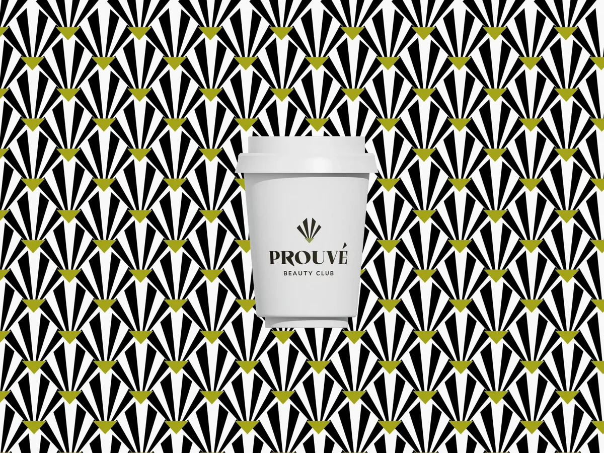
The fan shape works both as a standalone mark and as a repeating unit. Black, white and olive give the pattern definition while leaving the wordmark clear.
Symbol
A fan-shaped emblem gives the identity a concise geometric starting point.
Pattern
Repetition turns that emblem into a graphic field with a strong rhythm.
Typography & color
A restrained serif name and olive details balance the high-contrast pattern.
Identity,
in the world.
A branded cup shows the system at object scale. The plain label creates a quiet point of recognition within the patterned surround.
From the portfolio of
Khalinur Marupova / YEZA